APOPHENIA at Gallery Himmelblau - Visual Identity & Website
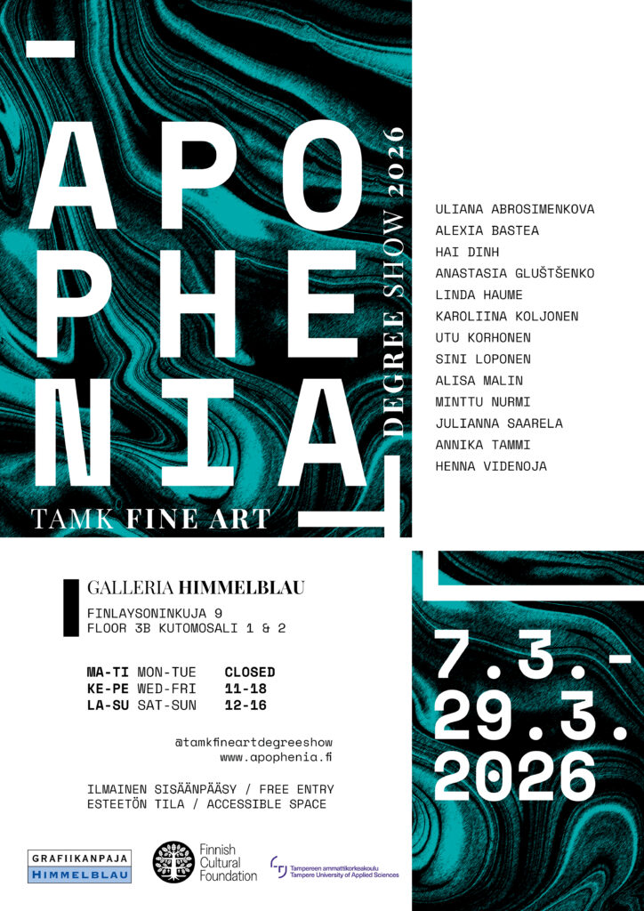
I created the visual identity of our TAMK Fine Art Degree Show 2026, APOPHENIA.
I started with the poster that would define the visual identity of the event, and from there we worked together as a group. I had another graphic designer in my team, and in addition to us, we had a separate marketing team which provided some material for social media.
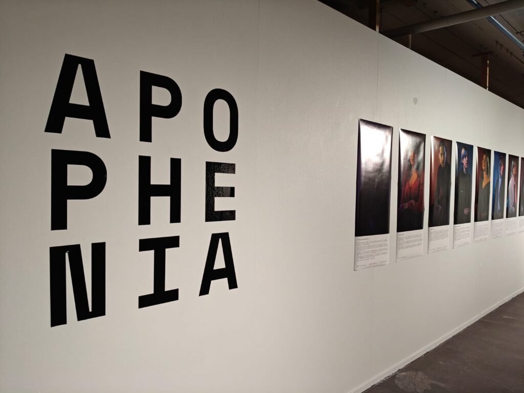
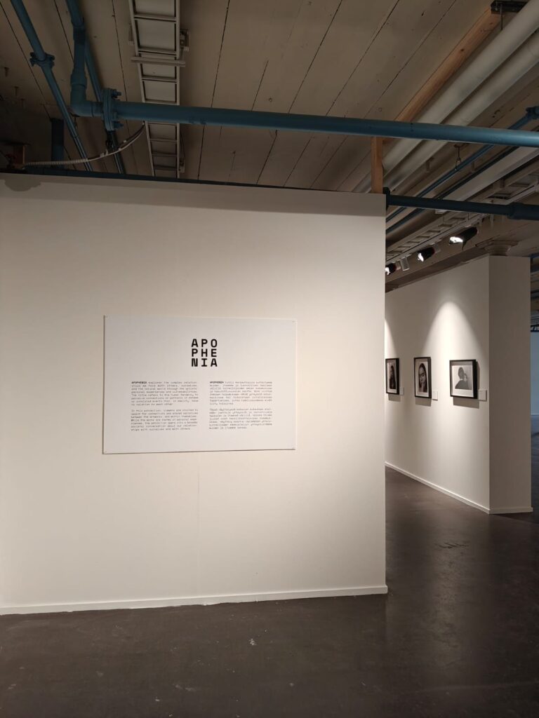
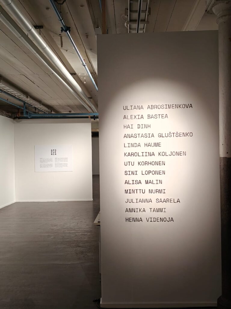
On top of the poster, I was in charge of the bigger text elements near the exhibition entrance, namely the title wall tape, exhibition introduction and its typography and the list of artist names.
The biggest challenge I had with the visual identity part was the fact that the art projects for the exhibition were not fully formed or finished at this point, so I couldn’t draw inspiration from them. I chose to focus on the name and some aspects regarding the artistic media used in the exhibited works – we had lots of paintings and some water involved.
The title APOPHENIA refers to the human tendency to find connections between unrelated things, and that led me to the design decision with the exhibition title and the line elements.
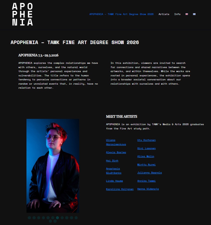
I also put together a simple website for the event, with some help from the previously mentioned design partner.
With the website project, one of the key things to consider was how do I present such a large group of artists in a ‘fair way’ which doesn’t give anyone too much of the attention when it comes to placement and design.
I solved this on the front page by creating an animated portrait slot which changes the pictures in a randomized order, with a smooth fade-in-fade-out style animation so it’s not too distracting.